
31 Stunning Burnt Orange Living Room Ideas That Transform Your Space
Burnt orange brings warmth, energy, and sophisticated earthiness to living spaces.
This rich, complex hue sits at the perfect intersection of cozy and dramatic, making it an excellent choice for creating memorable living rooms.
With its strong connections to autumn landscapes and desert sunsets, burnt orange adds instant warmth to cool-toned rooms while creating a perfect complement to natural materials.
Ready to incorporate this stunning color into your living space?
Explore these 31 burnt orange living room ideas that balance boldness with livability.
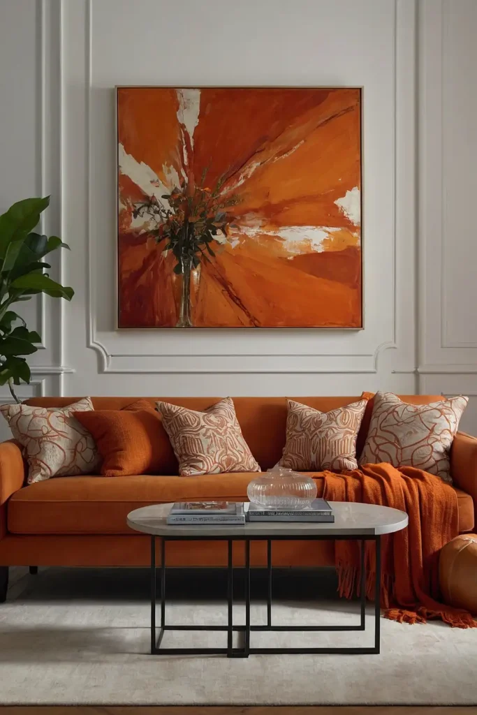
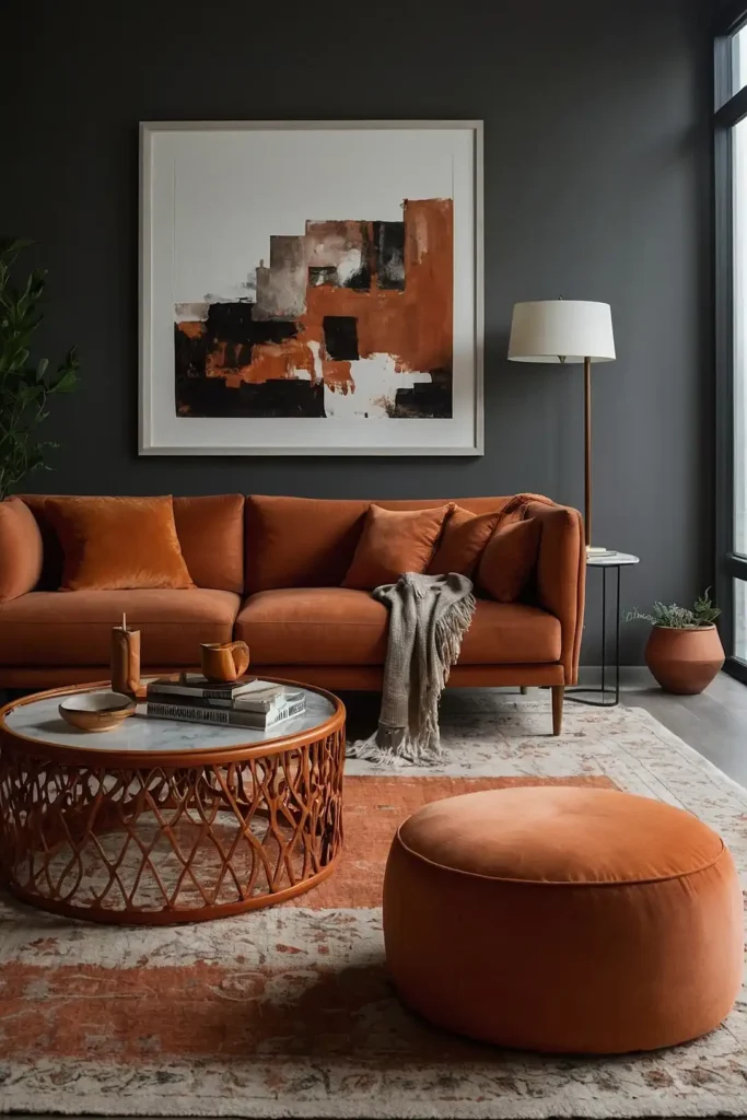
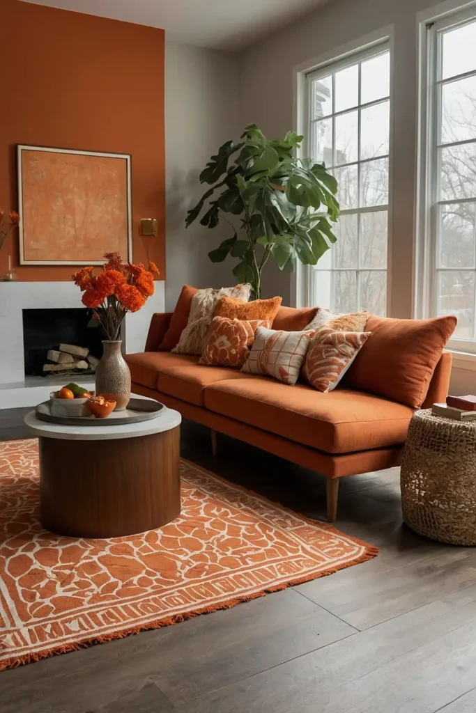
1: Statement Sofa Centerpiece
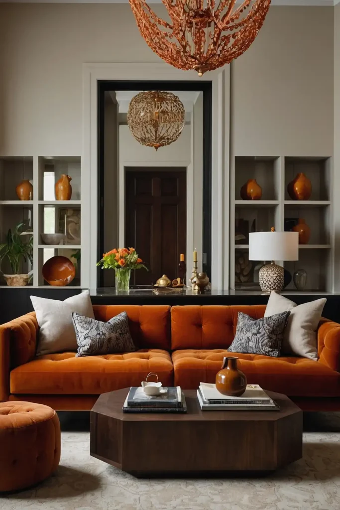
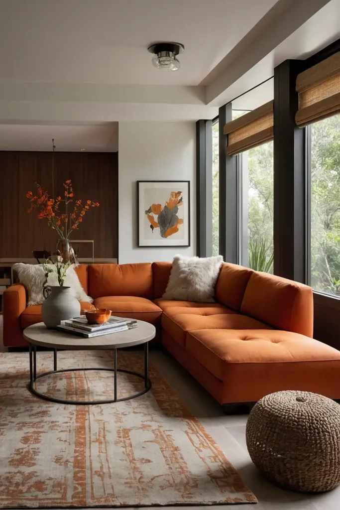
Make a bold declaration with a burnt orange velvet sofa as your room’s centerpiece. This substantial color commitment instantly establishes a warm, inviting atmosphere.
Balance the vibrant seating with neutral walls and natural wood elements. The rich color draws the eye while creating a cozy conversation area.
This investment piece serves as both functional seating and the room’s primary color statement, eliminating the need for additional bold accents.
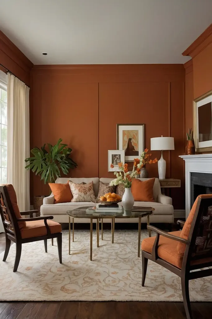
2: Textured Accent Wall
Transform one wall with burnt orange paint or textured wallpaper to create a focal point without overwhelming the space.
This strategic color placement adds warmth without dominating.
Choose textured options like grasscloth, subtle patterns, or techniques like color washing for added dimension.
The limited application creates impact while remaining manageable.
This approach allows you to experience the color daily while maintaining the flexibility to change other design elements as your taste evolves.
3: Layered Terracotta Textiles

Incorporate burnt orange through multiple textile layers—curtains, throw pillows, and area rugs—to create depth without permanent commitment.
This approach allows for seasonal adjustments.
Mix various textures like linen, velvet, and woven materials in coordinating shades.
The subtle variations create rich dimension while preventing the color from feeling flat.
This adaptable strategy lets you introduce the trend gradually while gauging how much orange feels right in your specific space.
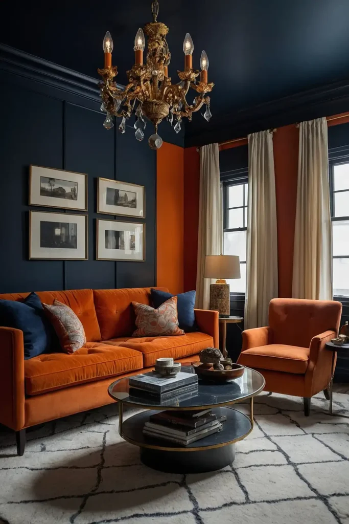
4: Complementary Navy Pairing
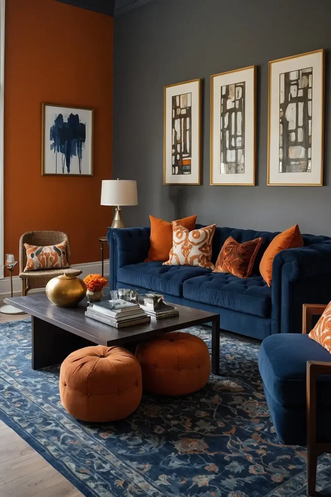
Combine burnt orange with navy blue for a sophisticated color relationship that balances warm and cool tones.
This classic pairing creates visual tension that energizes your space.
Use the deeper blue for larger elements like sofas or walls, with burnt orange as the accent color.
The complementary colors enhance each other’s vibrancy while creating balance.
This color combination works across design styles from mid-century modern to traditional, making it a versatile choice for various aesthetics.
5: Natural Wood Enhancement
Pair burnt orange accents with natural wood furniture to create a harmonious organic palette. The warm undertones in both elements create immediate cohesion.
Choose wood finishes in medium to dark tones that echo the richness of the orange. The natural variation in wood grain adds textural interest alongside the bold color.
This connection to natural elements prevents the orange from feeling artificial or trendy while creating a timeless, grounded aesthetic.
6: Boho Layered Approach

Create a relaxed bohemian vibe by layering burnt orange with other warm spice tones like cinnamon, turmeric, and clay.
This gathered-over-time aesthetic feels personal and inviting.
Mix patterns and textures freely while maintaining the warm color family. The eclectic combination creates a casual, collected atmosphere perfect for comfortable living.
This approach celebrates global influences while creating a space that feels both curated and comfortably lived-in.
7: Minimalist Color Blocking

Incorporate burnt orange in a minimalist space through deliberate color blocking against clean white walls.
This contemporary approach creates dramatic impact with minimal elements.
Limit the orange to specific zones or geometric shapes that complement architectural features.
The controlled application prevents the vibrant hue from overwhelming the minimalist aesthetic.
This disciplined approach satisfies the desire for bold color while maintaining the clean, uncluttered feeling essential to minimalist design.
8: Burnt Orange Leather Furnishings
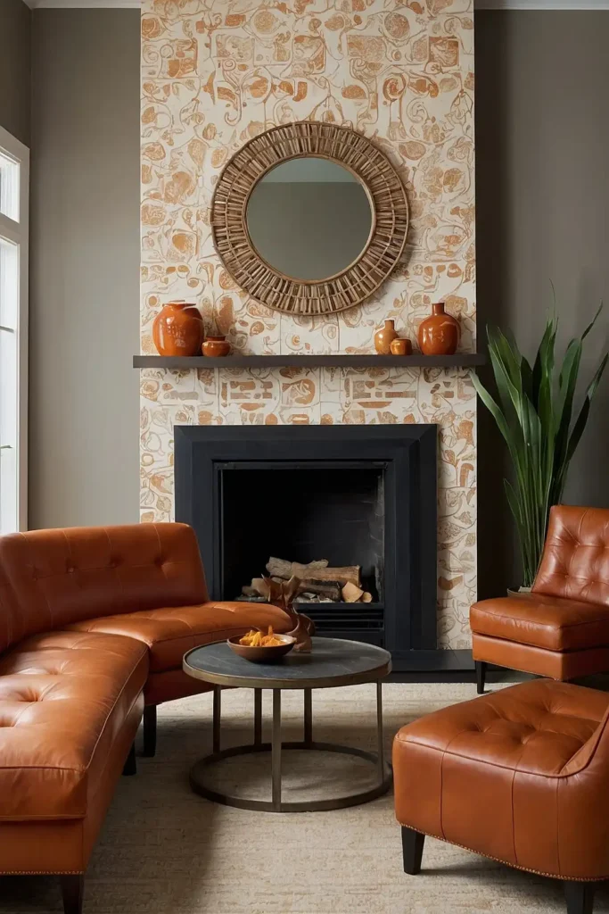
Invest in burnt orange leather seating that develops beautiful patina over time.
This material choice combines color commitment with practical durability for high-use living spaces.
Choose full-grain leather that will age gracefully with use. The natural material adds warmth while providing easy-care surfaces for family living.
This premium material elevates the color beyond trend status into investment territory, creating focal pieces that improve with age.
9: Desert Modern Inspiration
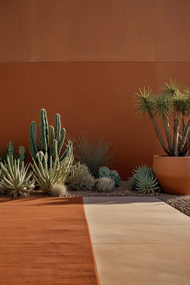
Create a desert-inspired palette combining burnt orange with sage green, sand, and terracotta tones.
This landscape-based approach feels harmonious and naturally cohesive.
Incorporate regional elements like southwestern patterns or cacti to reinforce the desert connection.
The complementary colors create a balanced atmosphere inspired by natural scenery.
This thematic approach gives purpose to your color choices while creating a consistently warm, grounded living environment.
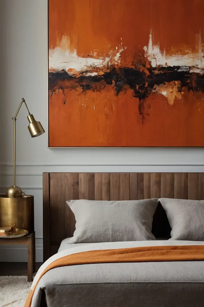
10: Vibrant Art Focal Point
Showcase a large-scale artwork featuring burnt orange as your room’s centerpiece.
This focused color application creates impact while allowing flexibility in surrounding elements.
Choose pieces with additional colors that can inspire other design choices throughout the space.
The artistic context elevates the orange from simple color to thoughtful design element.
This approach satisfies the desire for bold color while containing it within defined boundaries that won’t dominate your daily experience.
11: Dramatic Drapery Statements
Frame your windows with substantial burnt orange curtains that add both color and texture.
This vertical element draws the eye upward while softening hard architectural edges.
Choose full-length panels that puddle slightly on the floor for maximum drama.
The generous fabric creates a luxurious feeling while adding acoustic benefits.
This relatively easy update transforms your room instantly while allowing for seasonal changes if desired.
12: Mid-Century Modern Interpretation
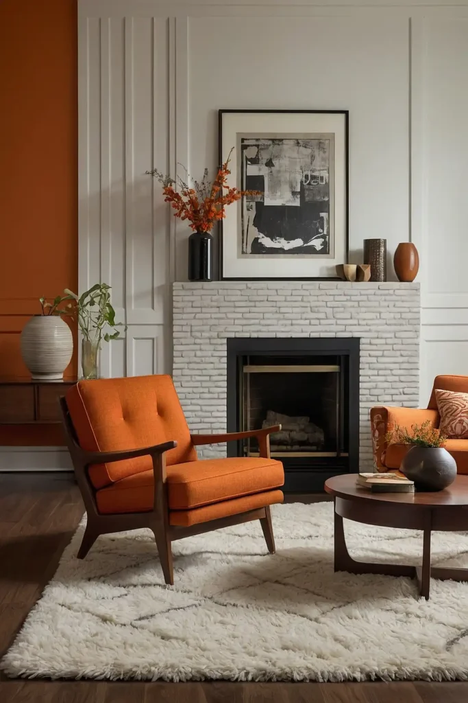
Embrace burnt orange in a mid-century context with sleek furniture featuring clean lines and minimal ornamentation.
This design period used the color extensively in authentic applications.
Pair with walnut wood tones and geometric patterns characteristic of the era.
The historical connection gives purpose to the color choice beyond current trends.
This style-specific approach creates a cohesive look with built-in design guidelines that prevent decorating missteps.
13: Gradient Color Story
Create a sophisticated palette by using multiple shades within the orange family from soft terracotta to deep burnt orange.
This tonal approach adds depth while remaining cohesive.
Distribute various shades thoughtfully throughout the space, with darker tones typically working better lower in the room.
The color gradient creates visual movement and interest.
This nuanced approach satisfies the desire for orange while creating a more complex, layered color story than a single shade could achieve.
14: Cozy Reading Nook
Designate a specific area like a window seat or corner chair as a burnt orange reading retreat.
This zone-specific approach contains the bold color within a functional vignette.
Add adequate lighting and comfortable accessories to enhance the nook’s usability. The defined color area creates a destination within your larger living space.
This targeted approach allows you to enjoy the energizing color in a specific functional context without committing to room-wide application.
15: Unexpected Ceiling Color

Paint your ceiling burnt orange while keeping walls neutral for a surprising color application that adds warmth without overwhelming.
This unexpected placement creates architectural interest.
Choose a shade slightly lighter than traditional burnt orange to prevent a heavy feeling overhead.
The reflected color casts a subtle warm glow over the entire space.
This unconventional approach makes a statement while keeping the color mostly out of your direct line of sight for daily living.
16: Rich Velvet Accents
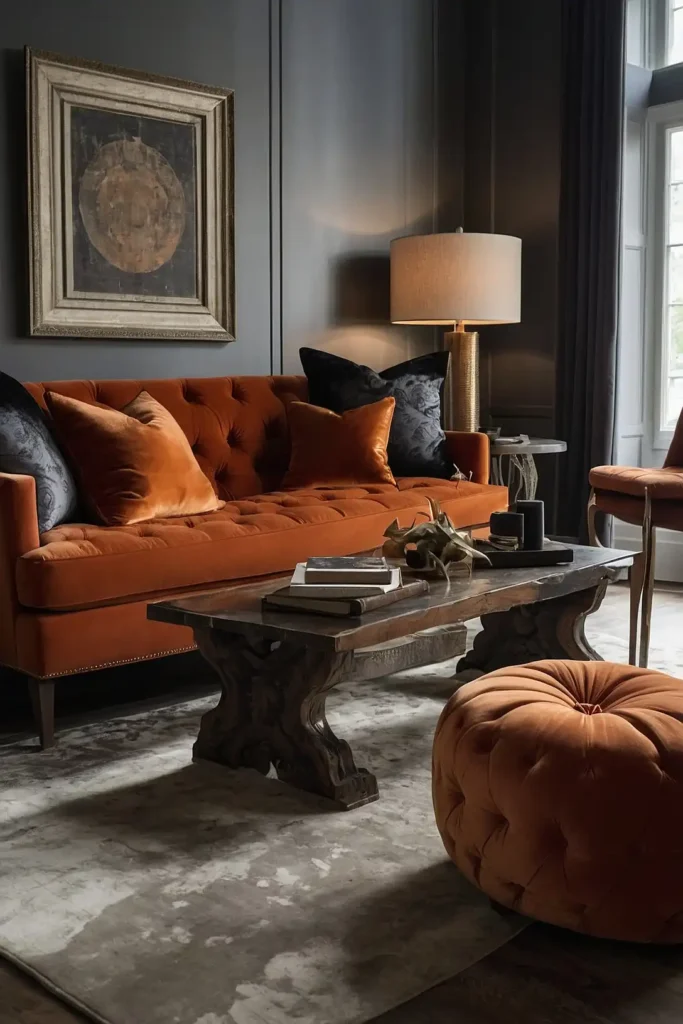
Incorporate burnt orange through luxurious velvet pillows, ottomans, or accent chairs. The sumptuous fabric adds both color and tactile interest to your living space.
Choose various shapes and sizes to create dimensional interest. The light-reflecting properties of velvet make the color appear even richer and more complex.
This fabric-specific approach elevates the color through material quality while providing cozy texture perfect for comfortable living rooms.
17: Earthy Rug Foundation

Anchor your seating area with a burnt orange rug that adds warmth from the ground up. This foundational element introduces the color while improving room acoustics.
Choose patterns that incorporate complementary colors to guide the rest of your design decisions.
The substantial size makes a color commitment while remaining changeable.
This grounding element creates a cohesive base for your design while defining the conversational area of your living room.
18: Glowing Metallic Accents
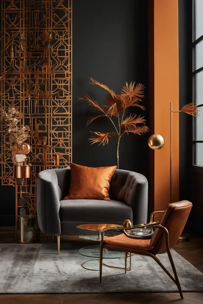
Pair burnt orange with copper or gold metallic accents that enhance its warm properties.
This combination creates a luminous quality that changes with different lighting conditions.
Incorporate metals through lighting fixtures, frame details, or decorative objects. The reflective surfaces create dynamic interaction with the rich orange tones.
This sophisticated pairing elevates the color beyond trend status into a timeless palette connection with universal appeal.
19: Dramatic Dark Contrast

Set burnt orange against dark charcoal or navy walls for dramatic contrast that makes the color appear even more vibrant.
This bold combination creates sophisticated visual tension.
Limit the orange to furnishings and accessories against the dark background. The stark contrast creates a dynamic, energetic atmosphere with depth and intention.
This high-drama approach works particularly well in spaces used primarily in evening hours when the rich color relationships shine.
20: Painted Furniture Statement
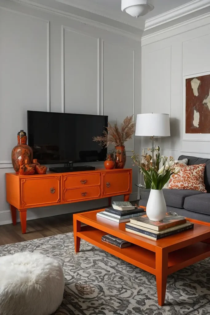
Transform a single furniture piece like a console, bookcase, or coffee table with burnt orange paint.
This focused application creates a custom look with manageable commitment.
Choose a piece with interesting architectural details that will be highlighted by the bold color.
The single painted element becomes a focal point within a more neutral space.
This approachable DIY option allows you to experiment with the color before making larger investments or commitments.
21: Subtle Pattern Introduction

Incorporate burnt orange through subtly patterned wallpaper or textiles where it appears as one color among many.
This restrained approach integrates the shade without overwhelming.
Choose designs where orange is balanced with neutrals or complementary colors. The pattern context makes the vibrant hue feel intentional rather than random.
This sophisticated strategy satisfies the desire for the color while containing it within a broader design scheme that maintains versatility.
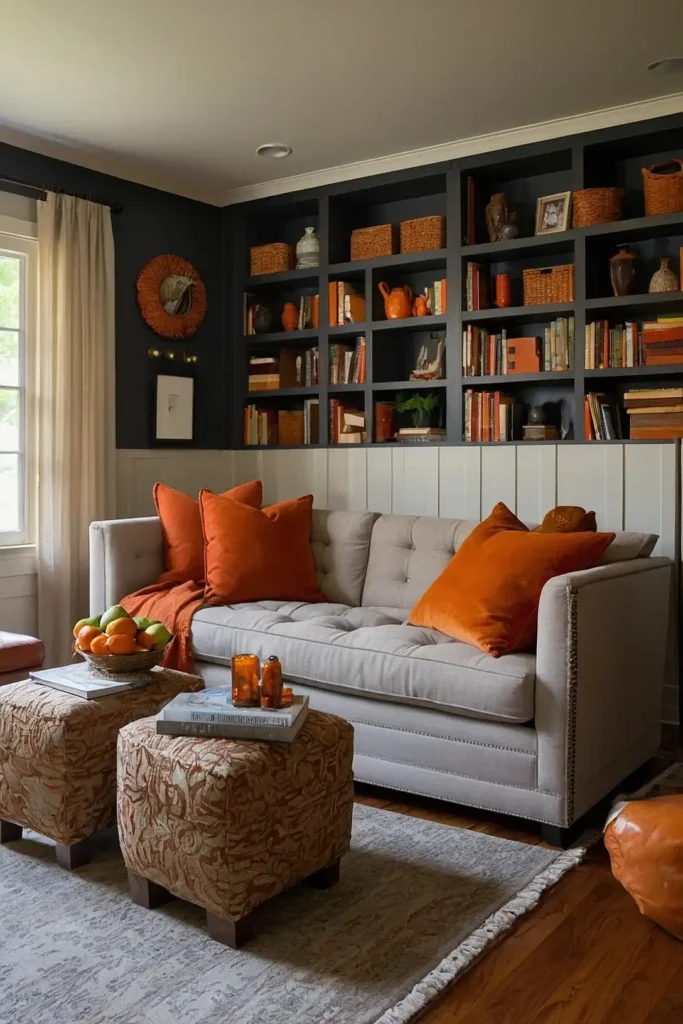
22: Seasonal Accent Strategy
Embrace burnt orange through easily changeable elements like throw blankets, pillow covers, and decorative objects.
This flexible approach allows seasonal rotation.
Concentrate these accents for maximum impact rather than scattering them throughout the room. The grouped presentation creates intentional color moments.
This low-commitment strategy allows you to experiment with the color or reserve it for autumn months when it feels especially appropriate.
23: Earthy Pottery Collection
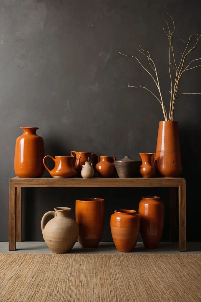
Display a collection of burnt orange ceramics and pottery as a cohesive decorative element.
This artistic approach adds color through objects with inherent beauty and function.
Group pieces for visual impact on shelving, mantels, or console tables. The varied shapes and slight color variations create interest within the cohesive collection.
This curated approach connects to the earthiness of the color while introducing it through authentic craft objects rather than manufactured items.
24: Sophisticated Lamp Bases

Introduce burnt orange through ceramic or glass lamp bases that add both color and necessary lighting.
This practical approach combines function with deliberate color placement.
Position lamps strategically to create balanced color distribution throughout the space. The illuminated quality enhances the warmth of the orange tones.
This dual-purpose strategy ensures your color elements earn their keep through functionality while creating warm, inviting lighting pools.
25: Muted Backdrop Approach
Choose a muted, dustier version of burnt orange for walls or large furniture pieces. This restrained approach creates warmth without the boldness of more saturated versions.
Pair with crisp white trim for definition or blend with similar earth tones for subtle dimension.
The understated application creates ambiance without demanding attention.
This sophisticated strategy satisfies the desire for warmth while creating a livable backdrop that won’t overwhelm daily experience.
26: Natural Fiber Complement

Pair burnt orange with natural fibers like jute, sisal, and rattan to balance its intensity with organic texture.
This combination grounds the color in nature-inspired elements.
Incorporate these materials through rugs, light fixtures, and accent furniture.
The textural contrast adds dimension while connecting to the color’s earthiness.
This balanced approach prevents the orange from feeling flat or one-dimensional by providing textural counterpoints with similar warm undertones.
27: Abstract Art Color Source
Let a favorite abstract artwork featuring burnt orange guide your color selections.
This art-driven approach creates built-in color harmony with personal meaning.
Pull exact shades from the painting for perfectly matched textiles and accessories.
The artistic context elevates your color choices beyond simple preference to intentional design.
This sophisticated strategy connects your space to the art world while ensuring all colors relate perfectly to each other.
28: Glazed Tile Accent
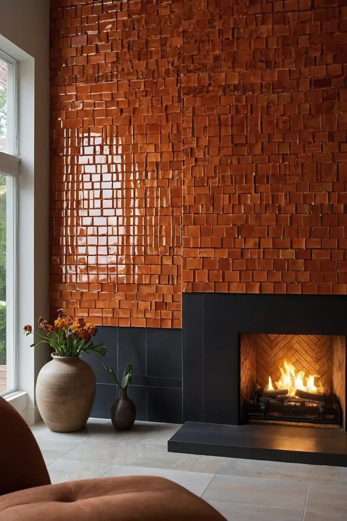
Install burnt orange glazed tiles on a fireplace surround, built-in niche, or small wall section.
This architectural application adds permanence and artisanal character.
Choose handmade tiles with slight variations for organic appeal or perfectly uniform tiles for contemporary spaces.
The reflective quality adds dimensional luminosity.
This commitment-level approach integrates the color into your architecture while connecting to ceramic traditions with historical depth.
29: Tone-on-Tone Layering

Create sophisticated depth by using burnt orange in varying intensities throughout your space.
This monochromatic approach feels cohesive while avoiding flatness.
Incorporate lightest shades on largest surfaces with progressively deeper tones on smaller elements.
The subtle variations create a complex color story with built-in harmony.
This designer approach demonstrates color confidence while creating a more nuanced experience than single-shade applications.
30: Unexpected Cabinet Color
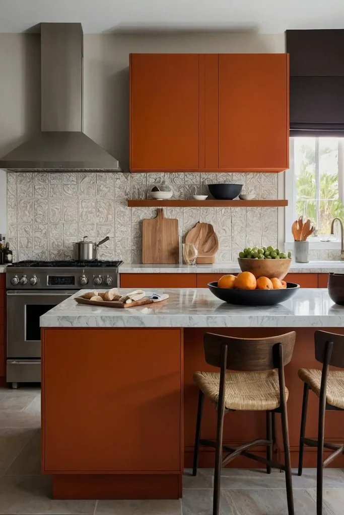
Paint interior cabinet backs or kitchen islands in burnt orange while maintaining neutral exteriors. This surprise application adds personality to functional spaces.
Ensure adequate lighting to showcase the color properly within cabinet interiors. The glimpses of orange create moments of delight without dominating.
This architectural approach integrates the color into your home’s structure while containing it within defined boundaries.
31: Warm Lighting Enhancement

Select light bulbs with warm color temperatures that enhance and complement burnt orange elements.
This atmospheric approach transforms how the color appears throughout the day.
Install dimmer switches to adjust the warmth as needed for different activities and times. The lighting quality can dramatically change how the orange elements appear.
This often-overlooked strategy ensures your color choices look their best while creating a consistently warm, inviting atmosphere in your living space.
Conclusion
Burnt orange offers remarkable versatility—from subtle accents to bold statements—while consistently delivering warmth and energy.
By thoughtfully incorporating this rich hue through these approaches, you’ll create a living room that feels both on-trend and timelessly inviting.


