27 Best Paint Colors to Boost Productivity in Your Office Space
The color of your office walls affects more than just aesthetics—it directly impacts your mood, focus, and productivity.
With many of us spending 40+ hours weekly in our work spaces, choosing the right paint color becomes a crucial decision for your success.
Different colors trigger specific psychological responses, from energizing blues to calming greens or focus-enhancing neutrals.
Your ideal office color depends on your work style, the nature of your tasks, and the atmosphere you want to create.
Ready to transform your workspace into a productivity powerhouse?
Explore these 27 expert-recommended paint colors designed to enhance different work styles and professional goals.
1: Tranquil Blue (Benjamin Moore Breath of Fresh Air 806)

This soft, airy blue creates a sense of calm focus perfect for high-stress work environments.
The subtle color reduces anxiety while maintaining alertness, helping you stay productive during challenging tasks.
Blue naturally lowers blood pressure and heart rate, counteracting workplace stress.
The light value ensures your space remains bright and open rather than dark or gloomy.
Consider this serene shade for offices where you handle complex problems requiring sustained concentration.
2: Energizing Green (Sherwin-Williams Organic Green SW 6732)

This refreshing mid-tone green balances energy with focus, creating an atmosphere conducive to creative problem-solving.
The natural color reduces eye fatigue during long work sessions at your computer.
Green psychologically represents growth and balance, perfect for offices where innovation matters.
The connection to nature helps reduce stress while maintaining mental clarity and productivity.
This versatile color works particularly well in offices with limited natural light or views of the outdoors.
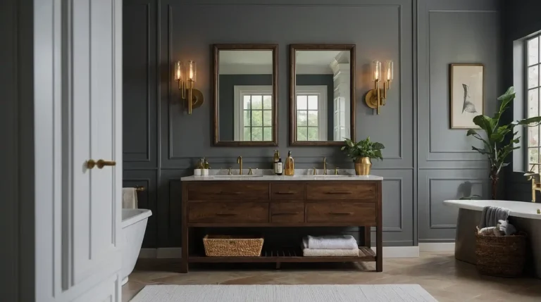
3: Sophisticated Greige (Benjamin Moore Edgecomb Gray HC-173)

This perfect gray-beige hybrid creates a warm, sophisticated backdrop that minimizes distractions without feeling cold or institutional.
The subtle warmth enhances focus without demanding attention itself.
Greige adapts beautifully to changing light throughout your workday, maintaining a consistent, professional atmosphere.
The versatile neutral complements virtually any furniture style or accent color you introduce.
Consider this balanced neutral for client-facing home offices where professional polish matters.
4: Crisp White (Sherwin-Williams Pure White SW 7005)

This clean, bright white maximizes light reflection, creating an expansive, energizing workspace.
The neutral backdrop allows colorful accents, artwork, or furniture to stand out without competing for attention.
White creates a blank canvas that adapts to different work modes and styles.
The brightness helps maintain alertness and clarity, particularly during afternoon energy slumps.
This timeless choice works especially well for small offices that need to feel larger and more open.
5: Soft Gray (Benjamin Moore Gray Owl OC-52)

This versatile light gray creates a sophisticated, distraction-free environment that enhances focus without feeling stark or cold.
The subtle warmth prevents the clinical feeling that cooler grays sometimes create.
Gray provides an excellent backdrop for technology while reducing glare and eye strain.
The neutral foundation allows accent colors to pop when introduced through furniture or accessories.
Consider this adaptable color for offices requiring sustained concentration on detailed tasks.
6: Pale Yellow (Sherwin-Williams Butter Up SW 6681)

This soft, buttery yellow adds subtle warmth and optimism to your workspace without overwhelming energy.
The gentle color stimulates creativity and positive thinking without causing visual fatigue.
Yellow psychologically promotes optimism and confidence, particularly valuable for entrepreneurs or those facing challenging projects.
The pale intensity ensures the color energizes rather than distracts or irritates.
This cheerful shade works particularly well in north-facing offices that need added warmth and light.
7: Navy Blue (Benjamin Moore Hale Navy HC-154)

This rich, sophisticated dark blue creates a focused, professional atmosphere perfect for executive home offices.
The depth adds confidence and authority while maintaining a calm, controlled environment.
Navy psychologically signals trustworthiness and competence, ideal for client-facing workspaces.
Pair with light furniture and trim to prevent the space from feeling too dark or heavy.
Consider this elegant color for accent walls in spaces where you want to project authority and expertise.
8: Sage Green (Sherwin-Williams Privilege Green SW 6193)

This muted, natural green creates a balanced atmosphere that promotes both focus and creativity.
The organic color reduces stress while maintaining sufficient energy for productive work sessions.
Sage combines the freshness of green with the neutrality of gray, creating versatile sophistication.
The subtle coloration works beautifully as a backdrop for both traditional and contemporary office furniture.
This calming color works especially well in busy offices where stress management matters as much as productivity.
9: Warm Taupe (Benjamin Moore Manchester Tan HC-81)

This balanced neutral creates a warm, welcoming environment without the potential distraction of more colorful options.
The subtle depth adds sophistication while maintaining a professional, timeless quality.
Taupe provides excellent flexibility with other design elements and lighting conditions.
The grounded color works particularly well for offices doubling as client meeting spaces or video conference backgrounds.
Consider this versatile shade for spaces requiring long-term satisfaction rather than trend-focused design.
10: Energizing Coral (Sherwin-Williams Coral Reef SW 6606)

This warm, vibrant color combines orange’s energy with pink’s creativity, creating an atmosphere that stimulates innovative thinking.
The unique shade adds personality without overwhelming your workspace.
Coral psychologically promotes conversation and enthusiasm, making it ideal for collaborative office areas.
Use on a single accent wall rather than throughout the space to prevent potential overstimulation.
This dynamic color works particularly well for creative professionals who need inspiration more than calm focus.
11: Dusty Blue (Benjamin Moore Mount Saint Anne 1565)

This sophisticated blue-gray creates a serene, focused environment with subtle depth and interest.
The balanced undertones work beautifully in changing light conditions throughout your workday.
Dusty blue combines the concentration-enhancing benefits of blue with the sophistication of gray.
The versatile color complements both warm wood tones and cooler metal finishes in your office furniture.
Consider this adaptable color for spaces requiring both creative thinking and analytical focus.
12: Soft Green-Gray (Sherwin-Williams Sea Salt SW 6204)

This chameleon-like color shifts between soft green, blue, and gray depending on lighting, creating visual interest without distraction.
The spa-like quality reduces stress during demanding work sessions.
Sea Salt establishes a connection to nature while maintaining professional sophistication.
The subtle color variation keeps your eyes from tiring during long hours at your desk.
This versatile shade works beautifully in offices with natural elements like wood furniture or plants.
13: Crisp Mint (Benjamin Moore Fresh Mint 2037-70)

This refreshing, cool mint creates an invigorating atmosphere that enhances alertness without the harshness of brighter colors.
The clean, fresh quality promotes clear thinking and mental sharpness.
Mint psychologically combines blue’s focus with green’s balance for sustained productivity.
The unique color adds personality to your workspace while maintaining professional appropriateness.
Consider this energizing shade for offices where you need to maintain high alertness and quick decision-making.
14: Warm Off-White (Sherwin-Williams Alabaster SW 7008)

This soft, warm white creates a clean, open atmosphere without the harsh, clinical feeling of pure white.
The subtle warmth enhances comfort during long work sessions while maximizing available light.
Alabaster provides an excellent backdrop for artwork, diplomas, or inspirational elements.
The versatile neutral works with any design style from traditional to ultra-contemporary.
This timeless choice adapts beautifully to changing office needs and furnishings over time.
15: Bold Teal (Benjamin Moore Aegean Teal 2136-40)

This rich, balanced blue-green creates a distinctive office environment that enhances both focus and creativity.
The depth adds sophistication while maintaining energizing properties for productive work.
Teal psychologically combines blue’s concentration benefits with green’s balanced energy.
Use on a single accent wall or throughout smaller offices for a memorable, confident workspace.
Consider this statement color for creative professionals who need both inspiration and focus.
16: Charcoal Gray (Sherwin-Williams Peppercorn SW 7674)

This deep, rich gray creates a sophisticated, cocoon-like environment that minimizes distractions and enhances focus.
The depth adds drama without the heaviness that black can bring to office spaces.
Charcoal provides an excellent backdrop for colorful accents or art pieces that inspire your work.
The dark neutral recedes visually, allowing your desk setup and equipment to become the focal point.
This grounding color works particularly well for offices requiring intense concentration or creative problem-solving.
17: Barely-There Blush (Benjamin Moore First Light 2102-70)

This subtle, sophisticated pink creates a warm, flattering glow without obvious “pinkness” that might feel unprofessional.
The gentle color enhances skin tones during video calls while providing just enough warmth.
Blush psychologically promotes optimism and creativity without sacrificing focus.
The barely-there intensity ensures the color reads as a neutral in most lighting conditions.
Consider this contemporary neutral for modern, style-conscious offices that need warmth without traditional beige or tan.
18: Classic Navy and White Combination

This timeless pairing uses Sherwin-Williams Naval SW 6244 on a single accent wall with Benjamin Moore Simply White OC-117 on remaining walls.
The high-contrast combination creates energy while maintaining professionalism.
Navy adds focus and authority while white areas expand the space visually.
This combination allows you to direct attention precisely where you want it in your office layout.
This versatile approach balances energy with sophistication for almost any professional environment.
19: Earthy Terracotta (Sherwin-Williams Redend Point SW 9081)

This grounded, warm neutral adds organic comfort to your workspace without obvious “color” that might distract.
The earthy quality creates connection to natural elements while maintaining professional appropriateness.
Terracotta psychologically promotes warmth and conversation, ideal for offices where client comfort matters.
The distinctive undertones work beautifully with natural materials like wood, leather, and plants.
Consider this unique neutral for spaces that need to feel both welcoming and distinctive.
20: Deep Green (Benjamin Moore Salamander 2050-10)

This rich, sophisticated green creates a focused, luxurious environment perfect for executive home offices.
The depth adds confidence and authority while connecting to natural elements that reduce stress.
Deep green psychologically signals growth, prosperity, and stability.
Pair with light furniture, trim, and ample lighting to balance the color’s intensity in your workspace.
This distinctive color works particularly well for offices dealing with financial matters or requiring confidential conversations.
21: Light Blue-Gray (Sherwin-Williams Misty SW 6232)

This versatile pale blue-gray creates a calm, balanced atmosphere that enhances focus without feeling cold or impersonal.
The subtle color reduces visual noise while maintaining an open, airy quality.
Blue-gray combines blue’s concentration benefits with gray’s sophistication and neutrality.
The versatile undertones complement most furniture finishes and accent colors you might incorporate.
Consider this adaptable shade for offices requiring long hours of focused computer work.
22: Warm Ivory (Benjamin Moore Swiss Coffee OC-45)

This creamy off-white creates a soft, welcoming atmosphere without the starkness of pure white.
The subtle warmth enhances comfort during long work sessions while maintaining brightness.
Swiss Coffee provides excellent light reflection without harsh glare on computer screens.
The versatile neutral complements both traditional wood furniture and contemporary office systems.
This classic choice creates a timeless foundation that adapts to changing work needs and styles.
23: Moody Blue (Sherwin-Williams Denim SW 6523)

This mid-tone blue creates a focused, productive atmosphere with more personality than standard office colors.
The depth adds sophistication while the blue family naturally enhances concentration.
Denim blue promotes calm focus without the potential drowsiness of lighter blues.
The adaptable color works beautifully with most metal finishes found in office furniture and equipment.
Consider this distinctive shade for creative offices that need both focus and visual interest.
24: Pale Gray-Green (Benjamin Moore October Mist 1495)

This subtle, organic green creates a balanced atmosphere that promotes both focus and wellbeing.
The muted color reduces stress while maintaining sufficient energy for productive work sessions.
Gray-green combines the freshness of green with the neutrality of gray for versatile sophistication.
The subtle coloration works beautifully in changing light conditions throughout your workday.
This calming color works especially well in high-stress professions where creating a soothing environment supports productivity.
25: Clean Gray (Sherwin-Williams Repose Gray SW 7015)

This perfectly balanced warm gray creates a sophisticated, distraction-free environment that works with any design style.
The subtle warmth prevents the clinical feeling that cooler grays sometimes create.
Repose Gray adapts beautifully to changing light throughout the day, maintaining consistent appeal.
The versatile neutral allows your work materials to stand out without competing for attention.
Consider this adaptable color for offices requiring long-term satisfaction rather than trend-focused design.
26: Energizing Teal-Blue (Benjamin Moore Blue Danube 2062-30)

This vibrant, saturated blue creates an energizing atmosphere that enhances alertness and motivation.
The distinctive color adds personality and confidence to your workspace.
Blue-teal psychologically promotes clear thinking and communication, ideal for writers or communicators.
Use on a single accent wall behind your desk to create a focal point without overwhelming the space.
This distinctive shade works particularly well for creative professionals who need to maintain energy throughout the workday.
27: Classic Beige (Sherwin-Williams Accessible Beige SW 7036)

This perfectly balanced beige creates a warm, timeless foundation for any office style.
The subtle warmth enhances comfort during long work sessions without distracting color that might tire over time.
Accessible Beige adapts beautifully to changing light conditions throughout your workday.
The versatile neutral complements both traditional wood furniture and contemporary office systems.
Consider this reliable color for client-facing offices where timeless professionalism matters more than trendy design statements.
Conclusion
The right office color can transform your productivity, focus, and work satisfaction.
Choose shades that complement your work style and professional goals, creating a space that energizes and inspires your best performance every day.