27 Perfect Paint Colors for Your Media Room: Transform Your Viewing Experience
Creating the ideal media room involves more than just selecting the right technology.
The perfect paint color can dramatically enhance your viewing experience, reduce eye strain, and create the immersive atmosphere you’re seeking.
From deep, light-absorbing hues to sophisticated neutrals, your color choice will set the foundation for your entertainment space.
You’ll want to consider how each shade performs in both low light and when the lights come up.
Ready to transform your media room into the ultimate viewing sanctuary?
Let’s explore the 27 best paint colors that will take your home theater experience to the next level.
1: Matte Black

Embrace true cinematic darkness with pure matte black walls.
This dramatic choice absorbs light reflections completely, creating the ultimate viewing experience for serious movie enthusiasts.
The non-reflective finish prevents distracting glare from your screen or projector.
You’ll appreciate how this color makes your screen appear brighter and colors more vibrant by contrast.
Balance this intense shade with lighter furniture and strategic lighting to prevent the space from feeling too cave-like.
2: Charcoal Gray

Create a sophisticated viewing environment with deep charcoal gray.
This near-black shade absorbs light effectively while feeling less severe than pure black.
The subtle warmth provides excellent contrast for on-screen colors to pop.
You’ll find this versatile color works equally well for dedicated theaters and multipurpose media rooms.
Consider a matte or eggshell finish to minimize light reflections from your screen or projector.
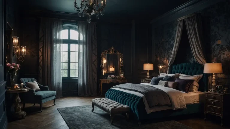
3: Navy Blue
Transform your media room with the rich depth of navy blue.
This sophisticated dark color minimizes light reflection while adding subtle character and warmth.
The deep blue undertones create a more inviting atmosphere than black while still providing excellent viewing conditions.
You’ll appreciate how this classic color creates a cozy, enveloping feeling perfect for movie nights.
Pair with brass or gold accents for an elegant, theater-inspired aesthetic.
4: Deep Burgundy

Wrap your media room in the luxurious intensity of deep burgundy.
This rich, red-based hue evokes classic theater curtains while effectively absorbing light.
The subtle warmth creates an inviting atmosphere without compromising viewing quality.
You’ll find this dramatic color adds immediate character and sophistication to your entertainment space.
Consider using this bold color on just the wall behind your screen with coordinating darker colors elsewhere.
5: Espresso Brown

Create a warm, rich environment with deep espresso brown walls.
This near-black brown provides excellent light absorption while maintaining a welcoming atmosphere.
The subtle warmth feels less stark than true black or charcoal options.
You’ll appreciate how this versatile color complements both traditional and contemporary media room designs.
This sophisticated neutral pairs beautifully with leather seating and wood accents for a classic media room aesthetic.
6: Dark Slate Blue

Embrace the sophisticated depth of dark slate blue for an effective yet distinctive media room color.
This muted, gray-blue creates an ideal viewing environment with character.
The balance of cool undertones with dark intensity minimizes reflections without feeling too severe.
You’ll find this color shifts beautifully between appearing nearly neutral to distinctly blue depending on your lighting.
Consider this versatile color for media rooms that double as gathering spaces for games or conversation.
7: Hunter Green
Transform your media room with the rich, timeless quality of hunter green.
This deep, saturated color absorbs light effectively while adding distinctive character.
The natural-world associations create a grounding, comfortable atmosphere for extended viewing sessions.
You’ll appreciate how this classic color creates a sophisticated backdrop that enhances any content.
Pair with leather accents and warm woods for a distinguished, club-room aesthetic.
8: Warm Pewter

Create a versatile, sophisticated backdrop with warm pewter walls.
This complex gray with subtle brown undertones provides good light absorption while maintaining a welcoming feel.
The chameleon-like quality adapts beautifully to different lighting conditions and décor styles.
You’ll find this balanced neutral works equally well in dedicated theaters and multipurpose media spaces.
This sophisticated color allows your technology and furnishings to take center stage.
9: Deep Plum

Envelop your media room in the unique richness of deep plum.
This distinctive purple-based hue absorbs light beautifully while adding unexpected sophistication.
The complex undertones create depth and interest without compromising viewing quality.
You’ll appreciate how this bold color adds drama and personality to your entertainment space.
Consider using this statement color on an accent wall behind your screen or seating area.
10: Graphite Gray

Establish the perfect viewing environment with sleek graphite gray walls. This medium-dark neutral efficiently reduces light reflection while maintaining versatility.
The balanced undertones work well with virtually any décor style or accent color.
You’ll find this practical color creates a professional-looking background that enhances your viewing experience.
This adaptable neutral allows your technology and entertainment to remain the focal point.
11: Dark Teal
Transform your media room with the dramatic depth of dark teal. This sophisticated blue-green creates an immersive viewing experience with distinctive character.
The rich jewel tone absorbs light effectively while adding personality beyond basic black.
You’ll appreciate how this complex color shifts between appearing nearly black in low light to revealing its teal richness when illuminated.
Pair with warm metallic accents for a luxurious, contemporary media room aesthetic.
12: Soft Black

Create a balanced media environment with soft black walls.
This slightly muted near-black provides excellent light absorption without the stark intensity of pure black.
The subtle softness feels more approachable for spaces that serve multiple functions.
You’ll find this versatile color works beautifully for serious viewing while maintaining everyday livability.
Consider this practical option for media rooms that need to integrate with adjacent living spaces.
13: Dark Chocolate

Wrap your media room in the rich warmth of dark chocolate brown.
This deep, saturated color minimizes reflections while creating a cozy, inviting atmosphere.
The natural warmth feels less severe than cooler dark colors while maintaining excellent viewing properties.
You’ll appreciate how this versatile color complements both traditional and contemporary design elements.
This grounding neutral pairs beautifully with most furniture finishes and accent colors.
14: Midnight Blue
Transform your viewing experience with the dramatic depth of midnight blue.
This near-black shade with subtle blue undertones creates an ideal cinematic environment.
The understated color reveals its richness when lights are raised between viewings.
You’ll find this sophisticated hue creates a more interesting alternative to basic black.
Consider a matte finish to maximize light absorption and minimize screen reflections.
15: Dark Olive

Create a distinctive media room with the complex richness of dark olive walls. This deep, muted green effectively absorbs light while adding natural-world warmth.
The military-inspired undertones add subtle sophistication and masculine energy.
You’ll appreciate how this versatile color transitions well between serious viewing and casual entertaining.
This unique neutral pairs beautifully with leather, brass, and wood elements.
16: Smoky Charcoal

Establish the perfect viewing backdrop with smoky charcoal walls. This nuanced dark gray contains subtle undertones that add depth beyond basic gray.
The complex color maintains excellent light absorption properties while feeling more sophisticated.
You’ll find this versatile neutral adapts beautifully to both contemporary and traditional media room designs.
Consider this practical color for multi-function spaces that need to balance viewing quality with everyday livability.
17: Deep Aubergine

Envelop your media room in the luxurious depth of deep aubergine. This sophisticated purple-black creates dramatic impact while maintaining excellent viewing properties.
The complex undertones add unexpected richness that reveals itself when lights are raised.
You’ll appreciate how this distinctive color creates an atmosphere of elegance and intrigue.
Pair with subtle metallic accents for a truly unique and upscale media room experience.
18: Steel Blue
Transform your media room with the balanced depth of steel blue.
This medium-dark, gray-blue creates a sophisticated viewing environment while maintaining versatility.
The subtle color adds character without compromising the cinematic experience.
You’ll find this practical choice works well in spaces that transition between serious viewing and casual entertaining.
This adaptable color complements most furniture styles and accent colors beautifully.
19: Deep Forest Green

Create an immersive viewing experience with deep forest green walls.
This saturated, nature-inspired color absorbs light effectively while adding distinctive character.
The natural associations evoke the quiet of deep woods, perfect for focused viewing.
You’ll appreciate how this rich color creates a cozy, enveloping atmosphere that enhances any content.
Consider this distinctive choice for media rooms looking beyond basic black and gray options.
20: Dark Taupe

Establish a sophisticated neutral backdrop with dark taupe walls. This complex brown-gray provides good light absorption while maintaining versatile appeal.
The balanced undertones bridge warm and cool elements in your media room design.
You’ll find this chameleon-like color works beautifully with virtually any design style or accent color.
This practical neutral allows your technology and entertainment to take center stage.
21: Carbon Gray
Transform your viewing space with the clean simplicity of carbon gray. This medium-dark neutral efficiently absorbs light while maintaining a contemporary edge.
The cool undertones create a sophisticated, modern atmosphere perfect for technology-focused spaces.
You’ll appreciate how this versatile color provides an ideal backdrop for your media equipment.
Consider this practical option for multi-purpose spaces that balance serious viewing with everyday livability.
22: Matte Dark Bronze

Create a unique media environment with matte dark bronze walls.
This metallic-inspired hue provides excellent light absorption with unexpected warmth and character.
The subtle brown-gold undertones add richness beyond basic dark colors.
You’ll find this distinctive color adds immediate sophistication to your entertainment space.
Choose a totally matte finish to prevent any unwanted reflections or glare during viewing.
23: Gunmetal Blue

Establish the perfect viewing atmosphere with gunmetal blue walls. This medium-dark blue-gray effectively minimizes reflections while adding subtle character.
The industrial-inspired color creates a contemporary, sophisticated backdrop for your technology.
You’ll appreciate how this versatile color transitions beautifully between serious viewing and casual use.
This adaptable hue works well in both dedicated theaters and multipurpose media spaces.
24: Dark Mocha

Wrap your media room in the rich warmth of dark mocha.
This deep brown with subtle reddish undertones creates a cozy environment without compromising viewing quality.
The coffee-inspired color feels inviting while still absorbing light effectively.
You’ll find this versatile neutral complements most furniture styles and accent colors beautifully.
Consider this approachable color for family-focused media rooms that prioritize comfort alongside performance.
25: Dark Emerald
Transform your media room with the jewel-toned richness of dark emerald.
This sophisticated green provides excellent light absorption with distinctive character.
The complex undertones add depth and luxury beyond basic dark colors.
You’ll appreciate how this bold color creates a memorable, immersive environment for any entertainment.
Pair with brass or gold accents for a truly luxurious, unique media room experience.
26: Charred Wood

Create a distinctive viewing environment with charred wood-inspired walls.
This complex near-black with subtle brown undertones effectively absorbs light while adding organic character.
The natural associations create immediate depth and sophistication.
You’ll find this unique color provides the perfect backdrop for both traditional and contemporary media room designs.
This versatile dark neutral complements most furniture finishes beautifully.
27: Soft Charcoal

Establish a balanced media environment with soft charcoal walls. This slightly muted dark gray creates an ideal viewing backdrop without the severity of deeper colors.
The versatile neutral works well for spaces that transition between viewing and other activities.
You’ll appreciate how this practical color maintains excellent light absorption while feeling more approachable.
Consider this adaptable option for family-friendly media rooms that prioritize both performance and comfort.
Conclusion
The perfect media room color balances light absorption, atmosphere, and your personal style.
Whether you choose dramatic black for serious viewing or a rich alternative for multi-purpose spaces, these colors will elevate your home entertainment experience.